
PPL SKY
DIGITAL WORKER EXPERIENCE
PPL sky team is a platform for employees working for the organization. With more than a thousand workforce in diverse roles ranging from in-office to in-the-job situations (outdoors), PPL is moving towards the 4th Industrial Revolution and has its business goals met. PPL has an existing digital worker experience, however, PPL wanted a refresh of the current experience without compromising the design system that existed and making a huge disruption.
Role
Lead UI
Deliverable
Mobile / Desktop / Tablet
Collaborators
Business Designers, UX Designer, Development Team

HOW DO YOU REDESIGN AN EXISTING WEBSITE WITHOUT COMPROMISING THE CURRENT DIGITAL WORKER EXPERIENCE?
THE PROBLEM
VISUAL DESIGN NEED A FACELIFT
The current SKY team has passed the age of time, it was due for a shift to a more modern and simple design yet very functional. However, the client insists that the changes should not be too jarring that it would confuse the current users.


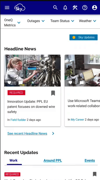
Current state design
IDENTIFYING VISUAL CHANGE
To understand what changes can be made, I first had to immerse myself as both a user using the website and a designer observing the current aesthetics. It was important for me to evaluate these two perspectives and derive a common consensus.
THE CHALLENGE
I observe and identify key elements that did not work visually. Some key problems were the use of the image as a background, certain inconsistencies in the design system, and the use of multiple typographies in the website. The oversized card design was also one of the main concerns.


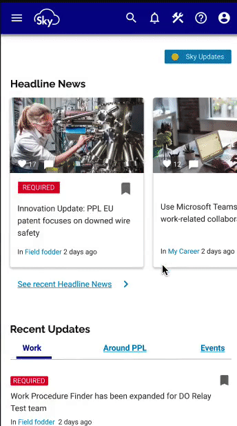
Current state design documentation
THE APPROACH
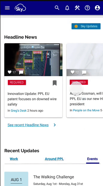
How do I then create a brand new look with the main objectives in mind? I started to play around with the existing colors on the design. I realize there was a use of a gradient in certain pockets of the design and it dawns upon me that I could use these as an anchoring design element. The treatment to use gradients is soft, it does not create a jarring effect, I removed elements that used images as a background and resized certain use of cards.


Wireframes for PPL
ENHANCING THE USER INTERFACE DIGITAL WORKER EXPERIENCE


CREATING A MOBILE FIRST DIGITAL WORKER EXPERIENCE

it is easy for users to use, it is straight-forward
SIMPLE
TO USE
using a good balance of white space to communicate with users
ENGAGING
using AI to validate users usage
EFFICIENT
illustrations and images are well designed to make it appealing
VISUALLY
ENRICHING

Communication channels are made easy to navigate for users to be updated with the current company news
Filters are designed to create ease for quick search

WHAT I LEARNT
I learnt that creating a User Interface from an existing design with systems in place is not an easy task. I have to be wary of all the design elements that are on the current state and having that visual library in my mind just so that I am able to have a seamless design throughout the pages. It was a very big challenge but it definitely heightened my design appreciation and skills further.
MORE WORKS


Ridwan Madon © Copyright 2009-2022. All Rights Reserved.