
Speculative Design
LINKEDIN REFERRAL FEATURE
Speculative Design
Linkedin is a well known social platform for professionals, recruiters and job seekers. Over the years, they have built themselves a platform to host great opportunities to network, exposure, gain insights into a company and so much more. While the interest to use this platform varies from person to person, there are a number of people who use Linkedin as a job-seeking opportunity. Seeking referrals from personal contacts in LinkedIn is made possible. Linkedin is looking at giving the referral options made available for professionals who are in the company and would like to give their referrals to people in their contact list. In return, they will receive 3 months prime subscription incentive upon referral and job confirmation from the referred party
Role
UX/UI Designer
Motion Graphics Designer
Project Type
UX/UI Design | UX Researcher
Technology
Illustrator/ After Effects/ Sketch
Project Timeline
2 Weeks
RESEARCH
FINDING THE RIGHT FOCUS
I started off with market research to gain a general understanding of the job search industry and Linkedin's user demographic. Although Linkedin caters to a broad professional audience, a majority of its users are Millenials, between 15 - 35 years old, which explains why Linkedin primarily targets the millennial generation. I also identified potential challenges by analyzing Linkedin's past update with their add job preferences and requests for referrals from people who worked in the company they wish to work for. Also, at the point of writing, only recruiters will be able to identify if you are looking for a job. Based on this research, it seemed best to ensure that there are sensitive issues pertaining to job seekers who would like to disclose their job-seeking hunt but are open to receive referrals. At the same time, there must be a clear distinction for referrals to know who are the job seekers.
LinkedIn Users Demographic
Total Number of Linkedin User: 590 Million
Total Active Linkedin User : 260 Million
Total number of Linkedin User in U.S: 154 Million
Percentage Monthly Active user : 44%
Number of new sign ups: 2 Members per second

More than 70% of Linkedin users are from Outside of United States
APPLICATION AUDIT
UNDERSTANDING DESIGN
I analyzed Linkedin’s mobile app to familiarize myself with the current design, documenting notes of all the main features. Doing so allowed me to gain a better understanding of Linkedin’s design patterns and how new features could be integrated. From the design, it was clear that the new feature should integrate well with the current design, but has to be distinct enough to make the user understand the new feature, especially for the person giving the referrals.

DEFINE
UNCOVERING INSIGHTS
From listening to Linkedin users, it wasn’t immediately clear if there were any issues with a referral. The interviewers seemed satisfied with the current referral website, although they are not aware of the app has the same feature. However, since this project added a priority for adding referral capabilities, it was important to uncover insights that were relevant to enhancing experiences for Linkedin users. By using an empathy map, I was able to identify user needs that would determine how to best incorporate referral capabilities in the Linkedin app.
They are not aware if the app has
the same feature
Observations
Users are not
aware of
referral feature
the incentives are very inviting
Users are comfortable with the website ux/ui
Have a certain
preference to the ux/ui that already exist
Spend most of the time on mobile
intuitive design
Short attention span
Enjoy quick details on profile
Themes
Insights
Opportunities
Design
I expected the user to be less picky about design
Attention
Users use their time to multi-task hence time is of the essence
Intuitive
Users have low tolerance and ux must be easy
Comfort level
Users are used to the common thread of ux/ui
Create a seamless design for users with little attention span that makes them use it fast
Observe common trending ux/ui that users are familiar with
Concise profiles make it more inviting for a user to digest information
Design can be simple and minimal with obvious prompts
White space can be explored for ease of eye movement
Displaying quick and good information about profiles
Transcribed post its observations
USER INFRASTRUCTURE
LOG ON TO
LINKEDIN WEBSITE AND LOOK AT NOTIFICATION
OBSERVE
PROFILES
AND FIND
POTENTIAL
CANDIDATES
MESSAGE
CANDIDATES
IF THEY
ARE LOOKING
TO BE
REFFERED
REFER
CANDIDATE
EMPATHY MAP
FEELINGS
TASK
INFLUENCES
PAIN POINTS
OVERALL GOAL
Urgency
Quick
Time consuming
Not intuitive
Not motivated
How to create an ux/ui that is intuitive for users to use?
How to create app with features users are already familiar with but making it with linkedin branding?
Intuitive design, minimal and addictive to use
Difficult to use and little attention span
Needs to be always on the go
It must be easy to use to user don't have to spend so much time figuring out how to use it
Create a minimally designed application that is easy to use with features that users are familiar with.
I created a persona “Katrina Amina” to represent the findings from the empathy map. Reflecting Linkedin’s target demographic, Katrina is a young professional of the millennial generation who often uses Linkedin for professional purposes. By giving context and personality to the research data, we can better empathize with the target user throughout the design process. Although Linkedin has a broad user audience, I chose to focus on a young adult persona because it’s Linkedin’s largest user group and it’s the user group that I collected the most primary data about.
PERSONA
Katrina Amina

Age
25 Years Old
Proffesion
Software Engineer
Location
New York City
Bio
Core Characteristics
Emotional
Tech Savvy
Introvert
Katrina Amina is a software engineer by profession. She enjoys using her phone when she is not doing her work, she has a lot of other applications on her phone and she switch between them when she gets bored. She enjoys using an app that gives her incentives or rewards, but it has to be easy to use because of her limited attention span.
Behaviors
-
Short Attention Span
-
Always on the go
-
Always using the phone when she is not doing her work
Goals & Needs
-
Need an intuitive designed app that she can digest easily to use
-
It must be addictive for her to use
-
Getting incentives from using the app
DISCOVERY
QUICK AND INTUITIVE WITH THE FAMILIAR
It is surprising to me that people prefer something that they are familiar with. Introducing something different is a novelty but because with the target audience and the persona in focus, it made me realize that these profiles prefer something that they know rather than creating something completely revolutionary. It probably has something to do with the quick phase of life and the limited attention span.
IDEATE
BUILDING THE APP
Conceptualizing the product was a crucial factor in the process. There were many things that we learned from this process, we learned that it is important that the pain points are met and addressed.
WIRE FRAME

DESIGN
After creating the application design, and doing some user testing, it made me realize certain points that needed change. People did not find it distinct enough to know whether the potential profile has looked at the company LinkedIn page or not. The updated page was not user-friendly, the overall font size was too small.


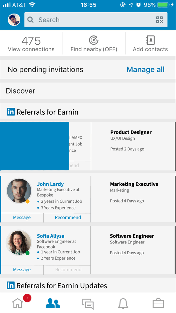


Users will swipe right or left to choose whom they want to refer. The referred person will be notified when they are being referred.


A second iteration was made to give a clearer view of how it could work with an alternative method.
ITERATION


Comments made previously were considered and a few iterations were done to address the concerns from the user testing. The fonts were made more visible, the profile is more concise with more information given. Users will know if the potential candidate has viewed the company profile page by the gradient circle around a potential candidate. They could also message them directly.
MORE WORKS


Ridwan Madon © Copyright 2009-2019. All Rights Reserved.